
Photographer Stephen Wilkes made photos of contemporary Chinese factories and the workers in them. An article explaining the background and his motivation is here. Well worth a visit!
You are currently browsing the archive for the Photography category.
Kirk Tuck of wrote two very interesting blog posts. The first is about art and digital photography. One sentence really stuck with me:
I hear a lot of people talk about how much better their work is with digital cameras and workflows but I personally don’t see this trend reflected in art. The images that art culture still talks about are mostly done on film.
The second post is about the changing/changed paradigm of camera use and the fact that most of us churn through our equipment instead of using it for many years.
We’re moving from a craft mentality which demanded a long and detailed mastery of all areas of a discipline into a post-craft world where the latest apps and styles take cultural precedence over perfectionism.
Alain Briot in “Marketing Fine Art Photography” writes at length about the fact that being an artist means constantly pushing toward the 100% perfection mark. In other words, being an artist (or a certain type of artist) is about the “craft mentality”.
It takes a lot of time and effort to get from “good enough” to “perfect”. If you switch equipment before you get there, you start over again. Because digital encourages switching equipment, far fewer practitioners reach perfection with their equipment than with film.
So maybe the fact that the “images that art culture still talks about are mostly done on film” is not a coincidence?
Afterthought: I am not claiming that it is necessary (or even desirable) to reach perfection to take good photographs. Striving for perfection may, however, be necessary to make Art.
In the last post, we looked at how a sharp image is created optically. In this post, we will look at how the physics render non-flat objects.
If all the points of the subject are in the same plane, they will all render with the same size circle of confusion in the image plane. This is the case if the subject is perfectly flat.
For non-flat subjects, the points of the subject are located at different distances from the image plane. So the projected points will have a minimal circle of confusion in different image planes. Since there is only one image plane, the projected points will all have different size circles of confusion – which means they will all be of different sharpness.
Each circle of confusion that is small enough will appear to be sharp. The distance from the nearest to the furthest point which are just rendered sharply is the depth of field.
The depth of field is determined by the distance of the subject from the camera, the focal length of the lens, and the aperture.
Some simple rules of thumb are:
1. The further the subject from the lens, the greater the depth of field for a given focal length.
The greater the absolute distance between subject and lens, the smaller the relative difference in distances for different points of the subject. Because of this, the size of the circles of confusion are very similar in size.
If you look at the distance scale on a lens, you will notice that the distance between markings decreases the closer you get to infinity. And, speaking of infinity, there is a point from which on everything is in focus if you focus the lens to infinity.
2. The shorter the focal length, the greater the apparent depth of field at a given distance.
The hyperfocal distance, or the distance from the image plane past which every subject point is acceptably sharp if the lens is focused on infinity, decreases the shorter the focal length of the lens. This is because the magnification decreases, so the circle of confusion for a given subject point is also magnified less.
Remember though, that this is true only for a fixed distance!
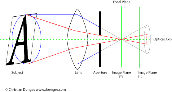
3. The smaller the aperture, the greater the depth of field.
The smaller the aperture, the smaller the cone of light rays that passes to the image plane. Because the cone is smaller, the circle of confusion is also smaller.
In the illustration below, the aperture blocks the blue cone of light rays, only the red cone gets through. The circle of confusion on the image plane is smaller, so the image is sharper.
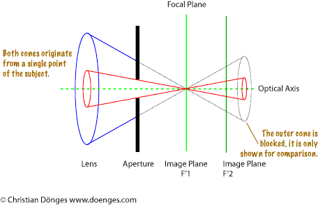 |
| Illustration 3: A smaller aperture reduces the circle of confusion |
Note that in practice, diffraction becomes a problem at small apertures. Diffraction will be discussed later in this series.
Bigger is not better
One important thing to keep in mind is that bigger is not necessarily better with depth of field. An image may actually be improved if (unimportant) parts are kept out of focus because the eye tends to focus (pun intended) on the part of the image which are sharp and tends to give the unsharp parts only cursory attention.
That said, if you are trying to render your image as clearly (sharp) as possible, you want to select your depth of field in such a way that the closest and furthest subject point which you want sharp are in focus.
For example, have a look at this image:
 |
| Image 1: The forget-me-not in the foreground is sharp, the background blurred. |
The forget-me-not flower in the foreground is rendered in focus. The (rather cluttered) background is rendered out of focus. The eye of the beholder will pass over the out of focus parts, thereby de-emphasizing the non-essential parts and concentrate on the subject in the foreground.
A common problem with photos is lack of sharpness. The image is either soft, or out of focus, or the wrong part of the image is in focus, or … the list of possible issues is a long one.
Just like exposure, focus is one of the parameters that the photographer must learn to control in order to create images that show what he or she visualized before pressing the shutter release.
This is the first of a series of posts that I will call “Image Clarity 101”. The name is a tip of the hat to John B. Williams who wrote the excellent “Image Clarity: High-Resolution Photography, which – alas – seems to be out of print.
I am going to look at what causes an image to be “sharp”. In later postings, I will explain what equipment and techniques to use to actually get an image to be “sharp”.
Focus
If we imagine that a subject is made up of an infinite number of minuscule points, each of these points emits an infinite number of light rays that hit the entire area of the camera lens. As the light rays pass through the lens, they are focussed on some point (the focal point) behind the lens, creating a cone of light.
Parallel to the lens plane is the focal plane, which holds an infinite number of focal points for all the visible points of the subject.
All of this is shown in the illustration below.
 |
| Illustration 1: Focus Explained (simplified) |
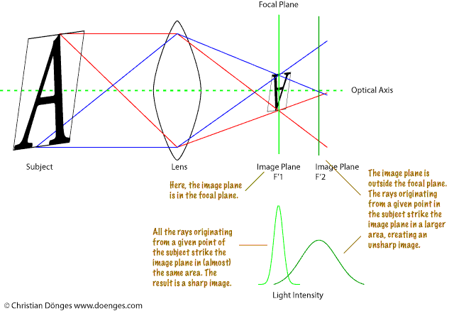
The image plane is the surface the image is projected onto. This is where the film or image sensor is located. For an image to be in focus, the image plane must be the focal plane.
When you twist the focus ring on a lens, you are effectively moving the focal plane. When the image is sharp, the focal plane is located on the image plane.
Are you with me so far? Good!
Circle of Confusion
Now it gets a bit messier: since we are dealing with the real world, the light rays do not actually all converge on a single point, but form a small area, the circle of confusion.
In the illustration above, you can see that in the focal plane most of the light originating from a single point of the subject hits the small circle. As the image plane moves away from the focal plane, the light is spread over a larger area.
If this is too circle of confusion business to too confusing, have a look at the following, simplified illustration:
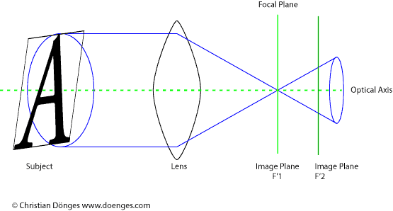 |
| Illustration 2: Cone of Light |
The subject is projected by the lens as a cone of light rays which strike the image plane. The tighter the cone is at the image plane, the close the image plane is to the focal plane.
If the circle of confusion is small enough, the human eye will register it as a single point. How small the circle needs to be is perhaps a topic for another post. For the time being, we can assume that if the circle of confusion is somewhat smaller than a single photo site on the sensor, it will not be a limiting factor for the overall sharpness of the image.
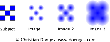 |
| Illustration 3: As the circle of confusion increases, the image becomes less sharp. |
So we reach a simple conclusion:
If a single point of the subject is rendered as a small enough circle of confusion, it will appear sharp in the image.
There is one important point to consider: all of what has been discussed above is only true for flat subjects and ideal lenses. In the next installment, we will look at sharpness for a non-flat subject.
If you don’t feel like getting an old book, you might try perusing the good old Wikipedia which contains much more on the subject.
In the last post I showed a picture of a marmelade fly on a yellow flower. I would like to revisit that picture to show how much an image can change depending on how – and with which tools – it is processed.
The original image was captured in RAW format. I then processed it in Adobe Lightroom 2. The result is this:

Marmelade Flies on a Yellow Flower processed in Adobe Lightroom 2
While I was reasonably happy with the image, I had to do some testing in Capture One Pro and decided to see if I could do better. I have long thought that Capture Ones color rendition is much better than Lightrooms. But judge for yourself:

Marmelade Flies on a Yellow Flower processed in Capture One Pro and Photoshop
Quite a difference, don’t you think? The first rendition looks almost like a painting while the second is so real you can almost touch it.
So how was it done?
I first opened the file in Capture One and set the exposure so that none of the color channels would clip. This part is identical to what I did in Lightroom. Note that the yellows are a bit darker in the C1 rendition than in LR. I then exported a 16-bit TIFF file to Photoshop from C1.
In Photoshop I created a mask to darken the green part to the left of the flower using a curve. A second mark darkened the bright leaf to the left and below the marmelade fly. Then I removed some spots from the yellow petals which were really there (i.e. not dust on the lens or sensor) but which I did not like. All of these steps are identical to what I did in Lightroom except that I did not darken the single bright leaf in LR.
I then added a watermark copyright note and reduced the size of the file. Finally, I used Pixel Genius PhotoKit Sharpener for output sharpening. All of this is fully automatic during the Lightroom export.
In total I spent about five minutes in Lightroom to get a decent image. I spent about half an hour in Capture One and Photoshop to get an excellent image. There is clearly a trade-off time for quality here.
That is why I usually perform all my culling, keywording, and rough editing in LR. When I have identified the handful of images with real potential I spend more time on them in C1 and PS. Now if only I could take the LR settings and use them in C1 so that, for example, I do not have to re-crop …

