Technique

You are currently browsing articles tagged Technique.

Within the Frame – The Journey of Photographic Vision by David duChemin may easily be the most unusual – and best – book on photography that I have read this year. It is unusual in that it manages to bridge the gap between books about photography as art and photography as technique, delivering both. In my opinion, that is what photography is about.

The first chapter is devoted to vision – what it is that you see and want to communicate. The second chapter focuses on what feeling, idea, or impression you may want to capture and what subjects may show this to the viewer. The third chapter on gear and technique required to get the image you want. I think that the focus not on creating technically perfect pictures but on how to turn something you want to communicate into a picture is spot-on. The author really nails it here!

The fourth chapter is about storytelling in pictures – how to tell a story in a single frame or in a photo essay, how to create interest in the viewer. This chapter is a must if you want to go from mere visual candy to a four-course meal.

The next chapters are about photographing people, places, and culture. I really enjoyed the chapter about people (I love photographing people and got a number of useful tips and ideas from the chapter), but found that my attention flagged halfway through the places chapter, and did not pick up to the end of the book. It seems to me that the essential message of the previous chapters are repeated a bit too often.

The pictures in the book are compelling and beautiful, the printing is of high quality. You can find a number of them on his website at www.pixelatedimages.com if you are interested. Despite all of the pictures having been taken in what amounts to “exotic” locations for most people from Europe or North America, I would not say that it is about travel photography. Everything in the book applies to taking pictures of your home town. Maybe even more so than when you are abroad …

I feel great respect for the way David duChemin approaches his subjects as human beings, not just props in his pictures. I feel the same way and I became aware of a lot of things that I have done without ever thinking about them. I have also learned a few very useful things about how to approach people.

The same applied for his treatment of technical aspects: he makes things that I have been doing intuitively become conscious decisions, giving me much more control. For example, I wish that I had read what he has to say about lens choices much earlier, it has taught me the value of wide-angle lenses, which I rarely use. This will definitely improve my ability to show my vision to the world. (Interestingly, he apparently went through a similar development, starting with telephoto lenses and only gradually learning to use wide lenses.)

Finally, I learned ever so much from his approach of treating photography as storytelling. If this is – as to me – a closed book (pun intended), you will benefit greatly from Within the Frame.

As I mentioned before, my attention and interest flagged towards the last two chapters. Maybe it was just too much to absorb? Maybe the chapters are simply weaker than the previous ones? I do not know. But I do know that even without the last two chapters the book is definitely required reading for anyone interested in photographing people, so it gets five stars!

5 stars (out of 5)

5 stars (out of 5)

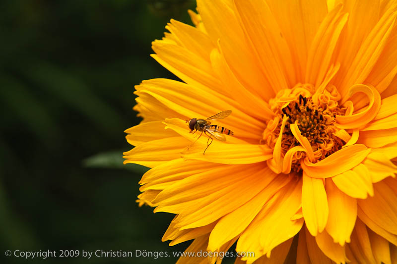
In the last post I showed a picture of a marmelade fly on a yellow flower. I would like to revisit that picture to show how much an image can change depending on how – and with which tools – it is processed.

The original image was captured in RAW format. I then processed it in Adobe Lightroom 2. The result is this:

A marmelade fly rests on the petals of a large yellow flower before taking flight.

Marmelade Flies on a Yellow Flower processed in Adobe Lightroom 2

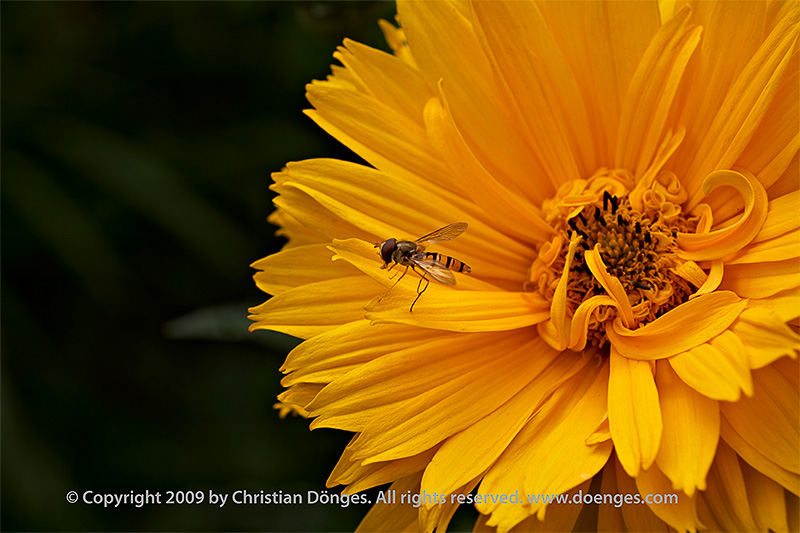
While I was reasonably happy with the image, I had to do some testing in Capture One Pro and decided to see if I could do better. I have long thought that Capture Ones color rendition is much better than Lightrooms. But judge for yourself:

A marmelade fly rests on the petals of a large yellow flower before taking flight.

Marmelade Flies on a Yellow Flower processed in Capture One Pro and Photoshop

Quite a difference, don’t you think? The first rendition looks almost like a painting while the second is so real you can almost touch it.

So how was it done?

I first opened the file in Capture One and set the exposure so that none of the color channels would clip. This part is identical to what I did in Lightroom. Note that the yellows are a bit darker in the C1 rendition than in LR. I then exported a 16-bit TIFF file to Photoshop from C1.

In Photoshop I created a mask to darken the green part to the left of the flower using a curve. A second mark darkened the bright leaf to the left and below the marmelade fly. Then I removed some spots from the yellow petals which were really there (i.e. not dust on the lens or sensor) but which I did not like. All of these steps are identical to what I did in Lightroom except that I did not darken the single bright leaf in LR.

I then added a watermark copyright note and reduced the size of the file. Finally, I used Pixel Genius PhotoKit Sharpener for output sharpening. All of this is fully automatic during the Lightroom export.

In total I spent about five minutes in Lightroom to get a decent image. I spent about half an hour in Capture One and Photoshop to get an excellent image. There is clearly a trade-off time for quality here.

That is why I usually perform all my culling, keywording, and rough editing in LR. When I have identified the handful of images with real potential I spend more time on them in C1 and PS. Now if only I could take the LR settings and use them in C1 so that, for example, I do not have to re-crop …

Church Ceiling

Church ceiling

The ceiling of the Freising cathedral.

The previous cathedral burned down almost exactly 850 years ago (April 5, 1159). Work on the current church started almost immediately but it took almost 100 years until the church was finally consecrated.

The interior was remodeled a number of times with the current rococo ceiling having been created by the Asam brothers around 1724. Everything looks shiny and new because major renovation and restoration works were completed recently.

The difficulty in capturing a scene like this is that the light coming in the windows is extremely bright while the shadow areas can be very dark. Most digital cameras can not handle the dynamic range in such a scene.

The solution is to use HDR (high dynamic range), which is a technique to squeeze more extreme light and darkness into an image than the camera sensor can capture. The trick is to create several exposures of the same scene (a tripod really helps :): one frame exposes the highlights correctly, the next the midtones, the final frame the shadows. Software magic then combines everything into one image. Because most monitors are 8-bit-per-color-channel devices (and JPEG supports only 8 bits per color channel) the resulting image is then rendered down into an 8 bit per channel representation.

The difficulty lies in the number of choices that must be made at every step. It takes a bit of experimenting to get good results.

Rick Sammon’s Complete Guide to Photographing People is just that: a comprehensive, in-depth look at how Rick Sammon takes pictures of human beings on his travels.

Rick starts by explaining that the camera looks both ways, which means that there is always an emotional connection (or lack thereof) between the photographer and his or her subject. This connection is at least as important as the technical aspects of taking the photo, since it determines the content. I believe that it is far too common for photographers to become far too focused on the technical aspects of photography instead of the content, so I like being reminded of this simple fact.
Read the rest of this entry »